alter planning co.
a boutique stationery brand looking for branding, design systems, product development, growth outreach, and creative direction

Outcomes
the brand
— design products + a brand that speak to productivity without being overwhelming
— make it visually stunning
— craft brand design system that works across products and assets
— appeal to the artsy and creative types
OBJECTIVE:


"how should it resonate? in the mind of the consumer?"
"how does the brand feel and look?"
the original moodboard
main logo
secondary logo
+
icons
foundationals informed:


01: brand launch
"get rooted"
- focused on growth strategy functionality + features in outreach
designed + offered free workbooks for lead generation
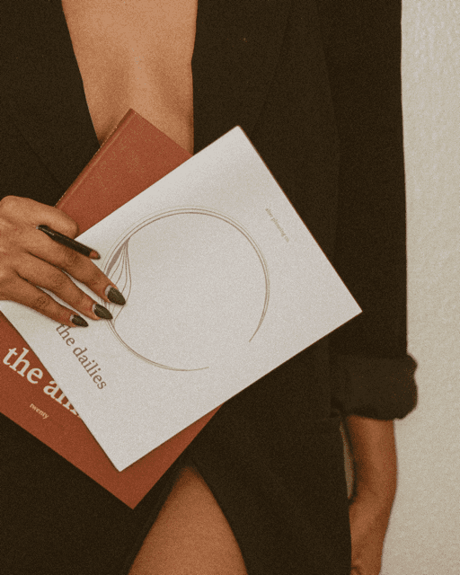
- created imagery that felt sensual, luxurious, mature, and unisex
(constant complementing contrast between organic and geometric shapes)
Designed yearly goal oriented planners, oversaw production
I photographed these, too
the brand & design systems, as well as the creative direction for Annual campaigns:
+43%
+93%
47.7%
email subscribers
avg. open rate/
email
IG followers


(designed and debuted new packaging)
03: season three (A)
"we are water"
fluid- created imagery that felt fluid and aqueous
(redesigned our daily planner to a coil binding)
blue for fluidity!

03: season three (B)
"cmplxn"
- Influencer Collaboration Journal with @LaBeautyOlogist, @EveMilanNY, & @Starasia
- one of a kind journal for learning Skincare and tracking skin health


I directed promo photography for the launch and subsequent campaigns
- Included an educational reference section, backed by research and peer reviewed by expert esthicians
adopted the brand's design system to create a skincare focused version, inspired by the design system of the flagship
04: season four
"new dawn"


Focused on capturing the opportunity and optimism in the air post quarantine
Designed and produced a coil binding design due to qualitative data from consumer surveys!
— was a hit!
02: season two (B)
"the tarot"
- Influencer Collaboration Journal with Tatianna tarot
- one of a kind journal for documenting and learning tarot cards


Collabs as growth strategy:
exposed brand to niche communities with purchasing loyalty + the brand PROVIDED a unique solution for a community
I cross collaborated with photographers for the launch and subsequent campaigns
- sold out!

adopted the brand's design system to create a TAROT focused version, inspired by the design system of the flagship
+47%
42.1%
email subscribers
avg. open rate/
email
250M
pinterest impressions
05: season Five
"The Mini"


— re-designed the Annual to be more compact, less pages, and lighter in weight
- Designed and launched Informational "Thank you" booklets.
zine-adjacent
included a "how-to-use" guide, thank you letter, and information about other products
open circle signifying the search for completion and perfection.
ridges and rings symbolizing the many components of life


(designed and debuted new packaging)

02: season two (A)
"structure + fluidity "
- prioritized iconic visual language to convey the minimal style of the product
(designed an undated version of the flagship)

— updates to the product layout, packaging, and website were made using the design system
(photographed the campaign, too!)


sleek design earned us a spot in Madewell's "Labels We Love"
— green was selected to reflect the years theme and inspiration from plant life
website design for this campaign
I crafted brAND foundationals:
earthy color scheme reflected the grounded tone the brand adopted


products featured in:
25K
45
12
email subscribers
products
press features
6 figs
in profit
